Challenge: to design a poster presenting the 2018–2019 season series for the Lyric Opera of Chicago.
Decision: Lyric Opera is already a brand, but I wanted to show it in a new light and invite new audience.
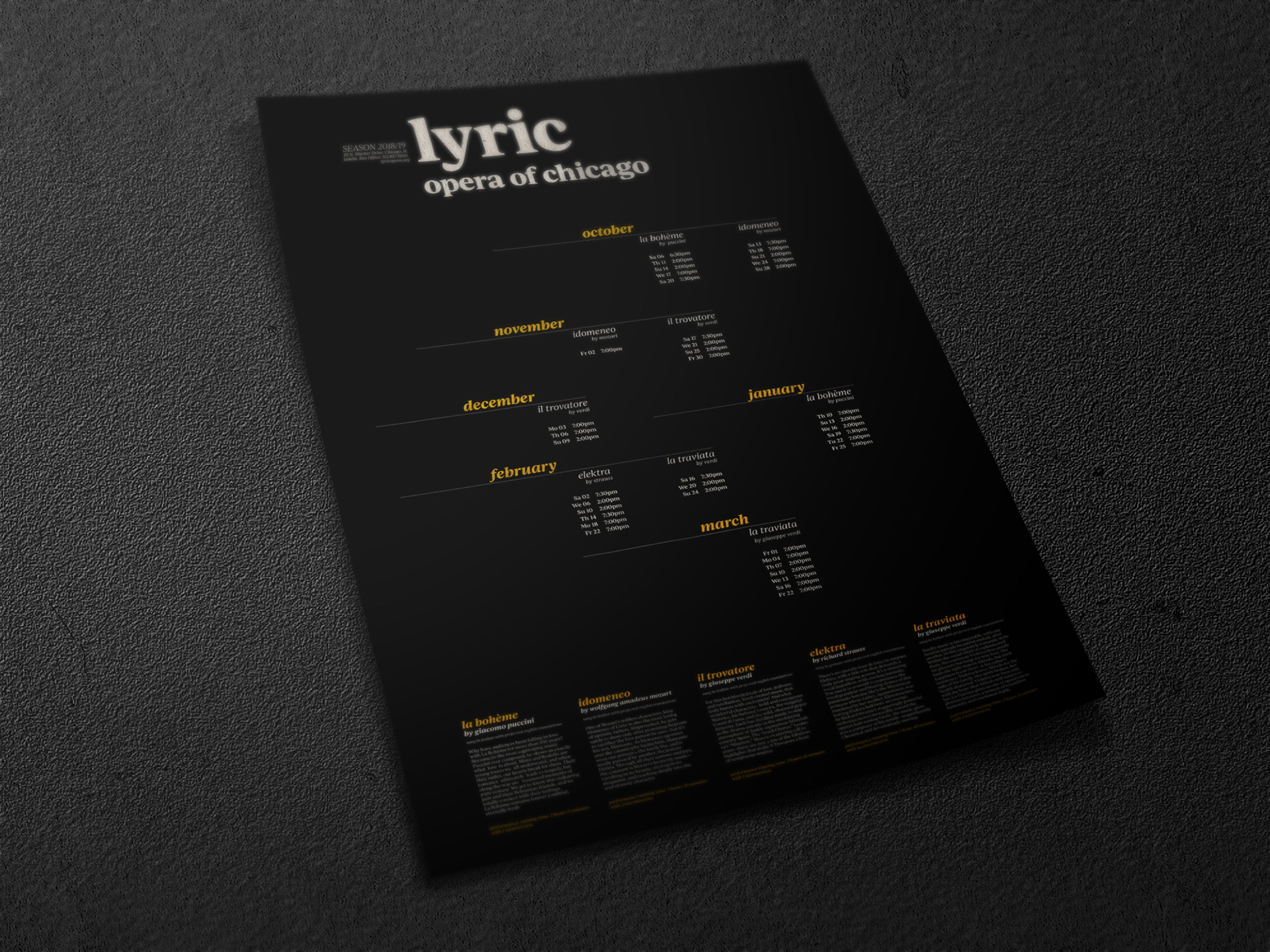
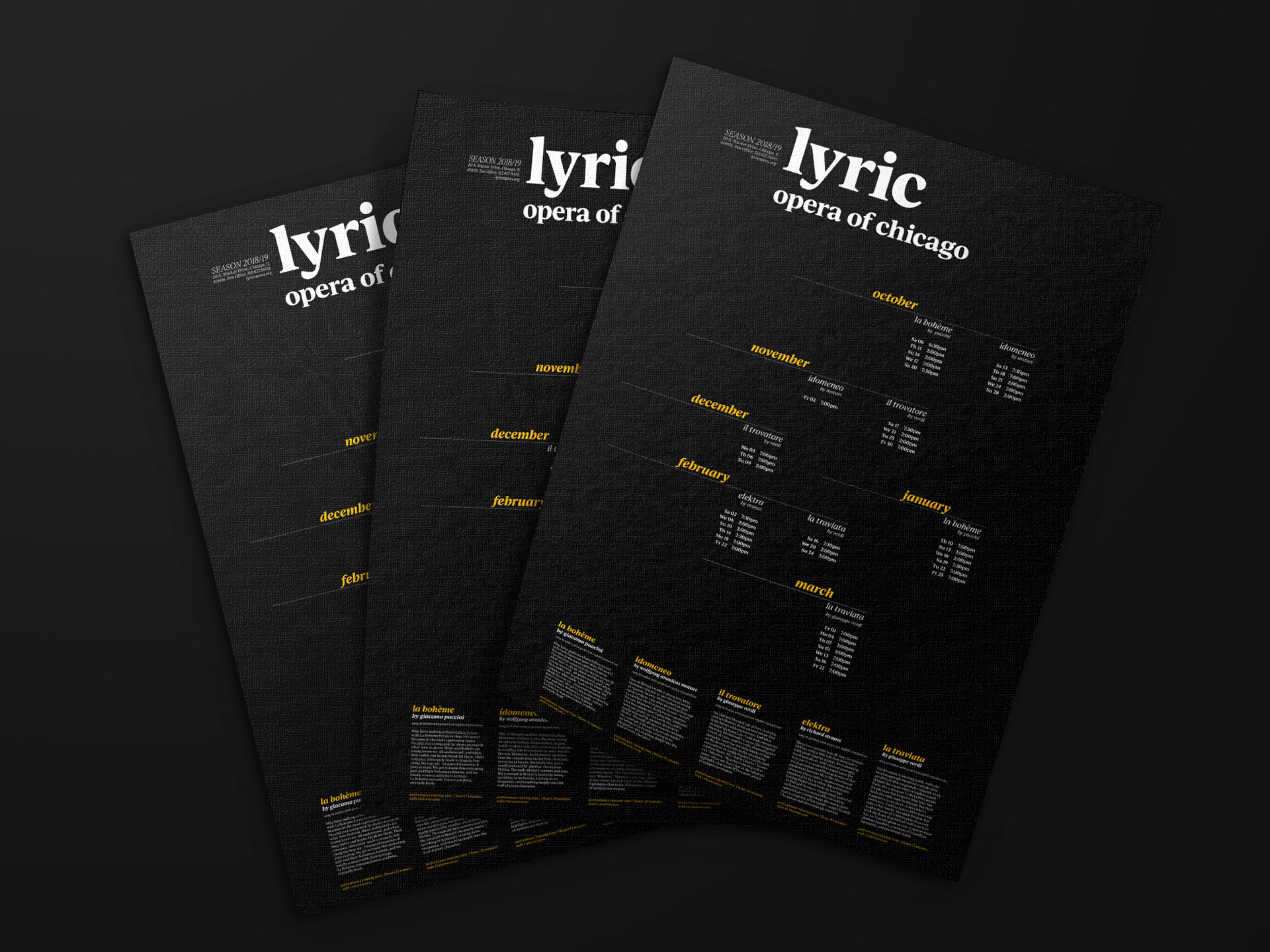
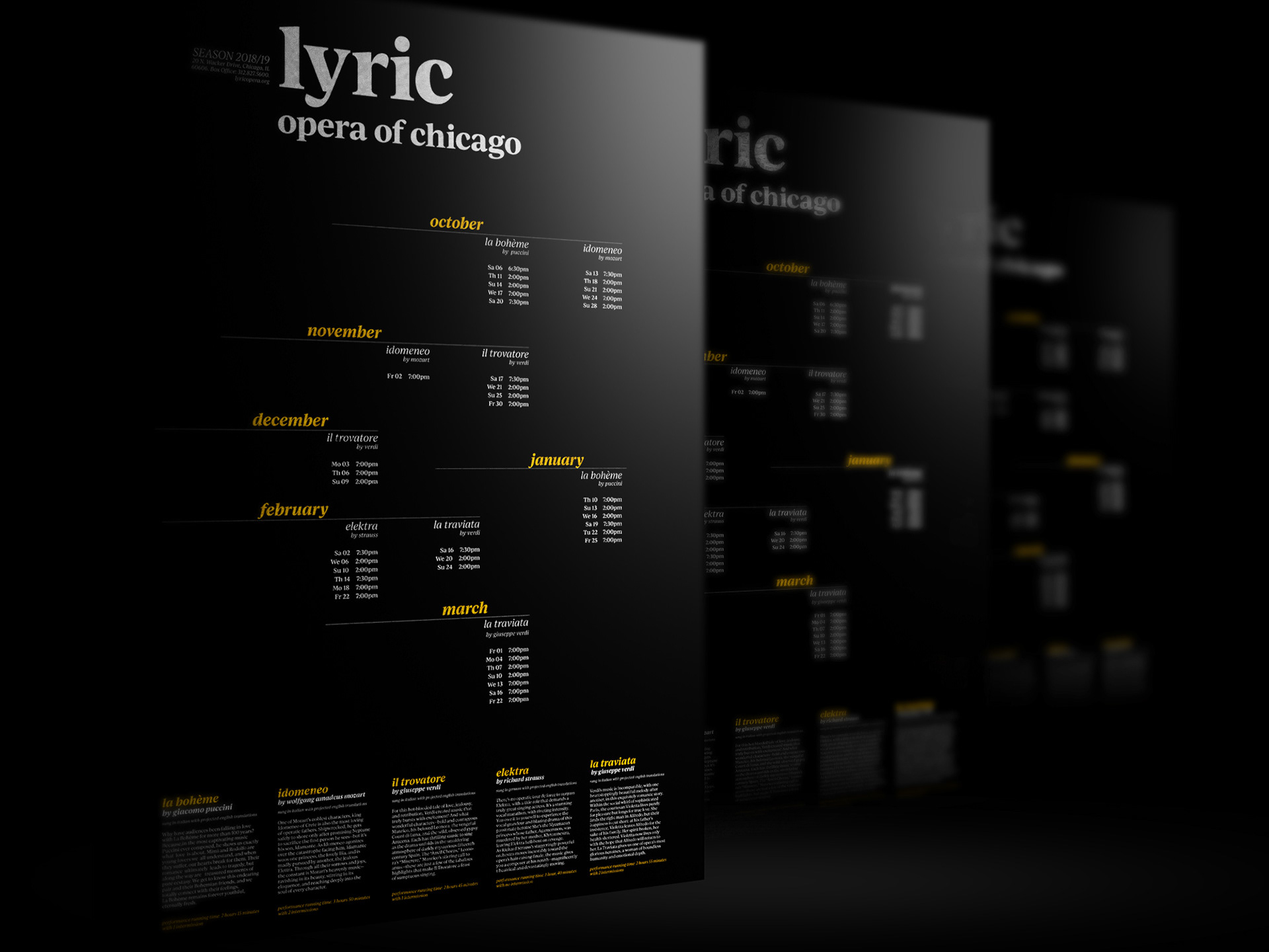
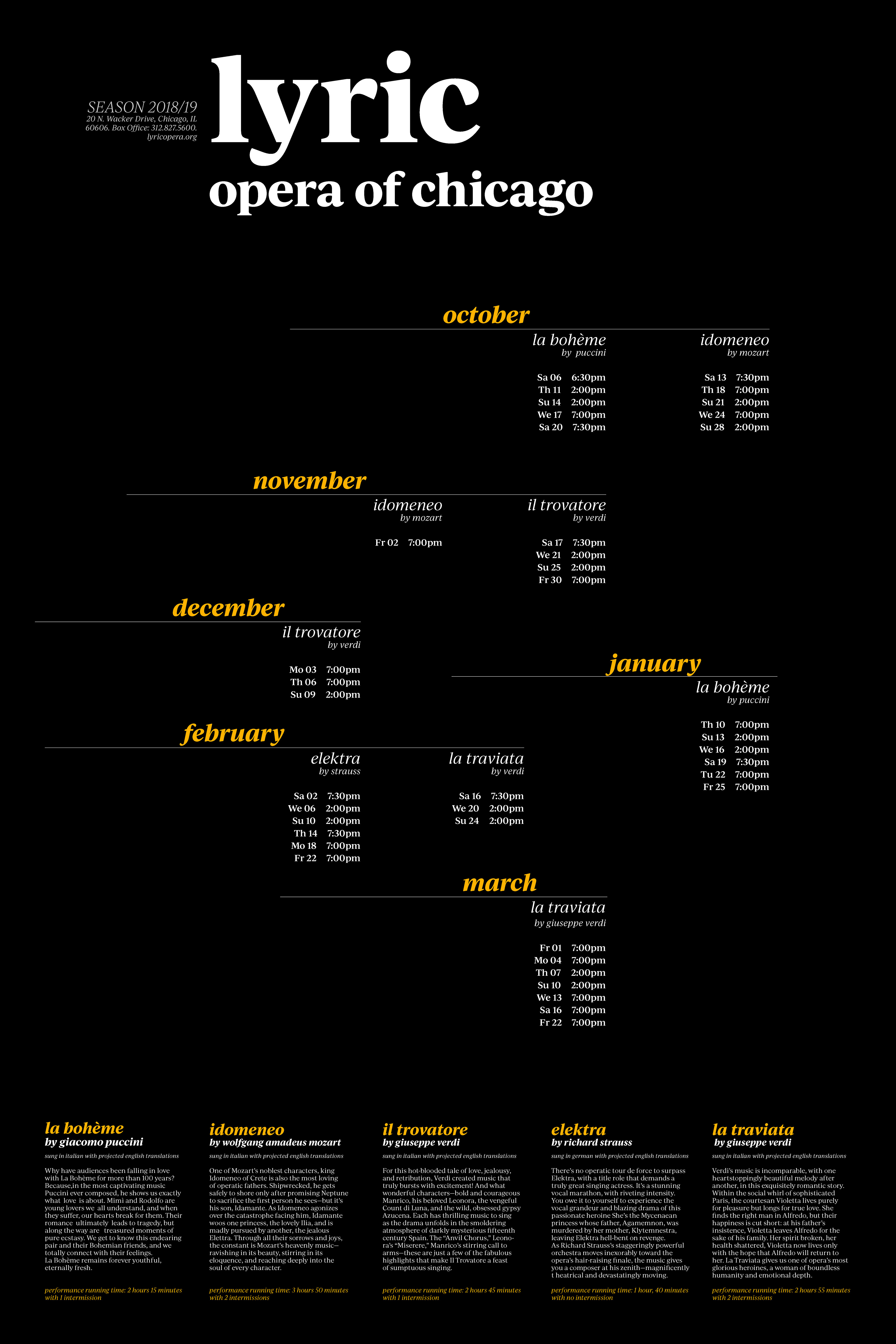
Poster is orientated on tourists and people who visit opera as special occation (for example as night out for a date). I want to invite and give a reason to dress up and feel all beauty of Opera in more modern way. By using rich black color for the background, white for main text and yellow, almost gold, for important text, I want to emphasise the luxurity of going to Lyric Opera.
I was limited to use only one typeface, so my decision was a choice of Ivy Journal font from Adobe Fonts Collection, which is great type family that has a range or weights. This font is a transitional serif created by Jan Maack. Serif keeps the feeling of how old Opera is in general, but modern style of letterforms talks for himself. Having large x-height, slite angular stress and calligraphic forms helps to read information quickly&easily. I also use a lot of italics and lowercase letters to create the feeling of less formal, more contemporary, but still elegant design.
I put the dates and times in priopity as the audience is dependent or limited on time (ex. tourists usually spent 2-7 days at the city, so they are looking not for a show, but for the specific day). Dates and times are not only taking the main space, but also create visual dynamics, which communicates to the reader in more joyful manner.
The general mood for this poster I would describe as #fancy.
first drafts:


thank you for watching and appreciating my project!